Subways are not just transportation networks; they are powerful catalysts for urban regeneration. The recent launch of the Elizabeth Line in London demonstrates how new metro lines can revitalize entire neighborhoods and stimulate city growth. Guiding the millions of passengers who use the subway each day are the maps—some of which are true works of design and urban art. Let’s look at some of the most fascinating subway map designs.
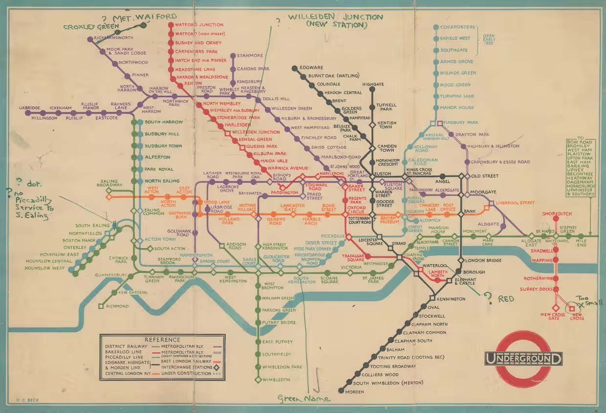
London Subway Map
For the iconic London Underground map created in 1931, engineer-designer Harry Beck drew inspiration from electrical circuit diagrams as well as cubist and abstract art. Beck’s revolutionary approach disregarded geographical scale, focusing instead on clarity, with straight lines and equidistant stations. This transformed the map into a readable diagram rather than an accurate representation of the territory, making it extremely popular and adaptable as London’s network continued to expand.

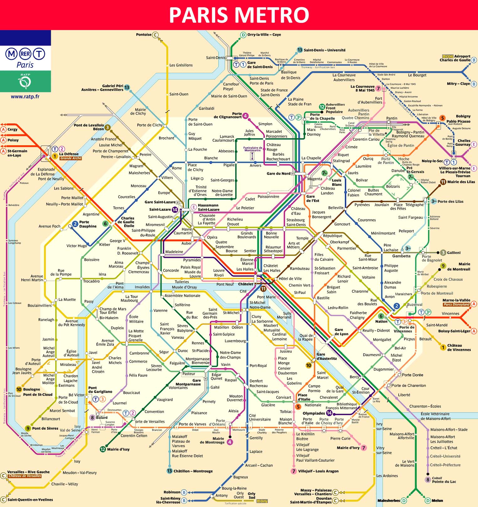
Map of Paris Subway
The Paris Metro map faces a unique challenge: integrating the urban structure with a dense network of lines, where stations are often only a few hundred meters apart. After World War II, Harry Beck attempted to introduce his schematic style in Paris as well, but his proposal was initially rejected. Over time, more simplified maps have been introduced, but the current version still retains elements of spatial accuracy.

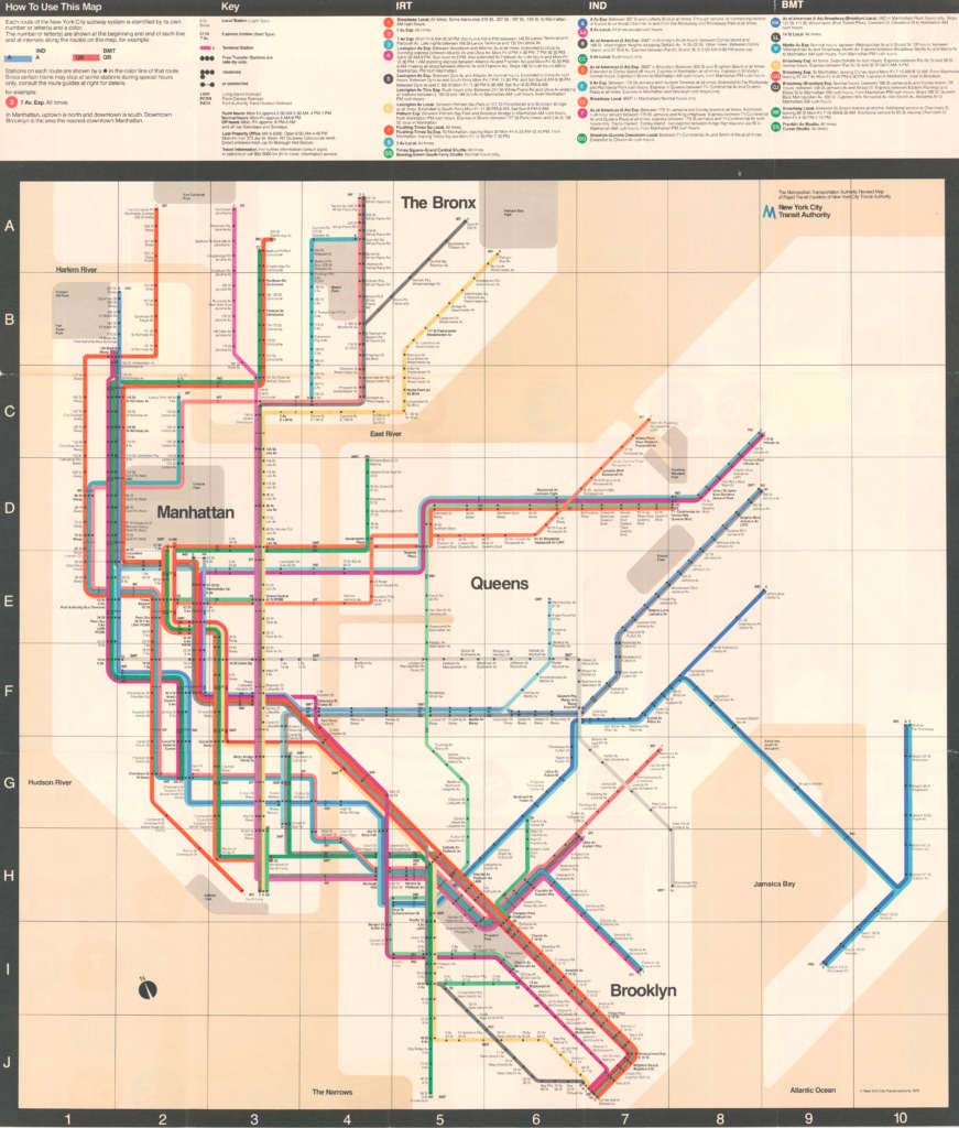
Old New York Subway Map
In 1972, the Metropolitan Transportation Authority of New York commissioned Italian designer Massimo Vignelli to create a modern, simplified map for one of the largest and most complex subway systems in the world. Vignelli’s map abandoned geographical accuracy, opting for a rectilinear design with lines intersecting at 45- and 90-degree angles. Each stop was marked by a simple dot, with a neutral background and brightly colored lines, making it visually appealing and easy to read. Initially criticized for its abstract style, the old New York Subway map eventually gained a cult status, even earning a place in the Museum of Modern Art.

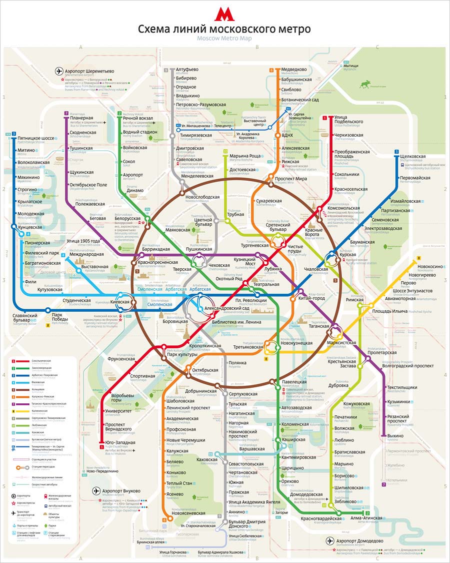
Moscow Subway Map
Among the busiest networks in the world, the Moscow Metro stands out for its Koltsevaya circular line, which encircles the center and facilitates connections between the radial lines extending toward the suburbs, reflecting the city’s radial layout. In 2013, the Art.Lebedev studio introduced a major redesign, chosen through a public vote. This new map combines modern design principles with the network’s history, balancing clarity with Moscow’s unique urban layout.


